

Principles of graphic design
Create visually stunning designs
Welcome to the world of graphic design, where art and technology combine to create captivating visuals that make a lasting impression. In today's digital age, effective graphic design is essential for businesses to stand out from the competition and communicate their messages effectively. This article explores the fundamental principles of graphic design and how they can be applied to create visually stunning designs. Whether you're a business owner looking to enhance your branding or an aspiring designer, these principles will guide you to unlock the potential of great design.
1.Balance: Achieving Visual Harmony

Balance is a key principle in graphic design, ensuring that elements are distributed harmoniously within a composition. There are two types of balance:
Symmetrical Balance:
Achieving equilibrium through mirroring identical elements.
Asymmetrical Balance:
Balancing different elements based on their visual weight and hierarchy.
Practical Tip:
In a business card design, balance the logo and contact information using asymmetrical balance, allowing the logo to have more visual weight.
Example:
Look at the logo of British Airways, where the visual weight is evenly distributed, giving a sense of stability and professionalism.
2.Colour Theory: Conveying Emotions and Messages

Colours have the power to evoke emotions, convey messages, and establish brand identities. Understanding colour theory is essential for effective graphic design.
Warm Colours (e.g., red, orange, yellow):
Convey energy, warmth, and excitement.
Cool Colours (e.g., blue, green, purple):
Evoke calmness, trust, and professionalism.
Complementary Colours:
Colours opposite each other on the colour wheel create vibrant contrast.
Practical Tip:
Use warm colours for attention-grabbing elements like call-to-action buttons, while cool colours can be used for backgrounds to create a sense of tranquillity.
Example:
The use of blue and white in the logo and website design of Barclays Bank conveys trustworthiness and reliability.
3.Typography: Choosing the Right Fonts

Typography plays a vital role in graphic design, enhancing readability, setting the tone, and conveying messages. Consider these factors when choosing fonts:
Legibility:
Ensure the font is easy to read, even at different sizes.
Hierarchy:
Use different font styles, sizes, and weights to create a visual hierarchy.
Brand Alignment:
Select fonts that align with your brand personality and values.
Practical Tip:
Use sans-serif fonts for online content to ensure legibility, and experiment with different font weights to create visual contrast.
Example:
The font choices in the logo of Virgin Group convey a sense of playfulness and innovation, aligning with their brand identity.
4. Visual Hierarchy: Guiding the Viewer's Eye

Visual hierarchy helps guide the viewer's eye through a design and ensures the most important elements are emphasized. Key techniques to establish hierarchy include:
Size:
Larger elements attract attention and signify importance.
Placement:
Position important elements strategically to capture attention.
Contrast:
Use variations in colour, shape, and typography to create contrast.
Practical Tip:
Place the most critical information, such as headlines or key messages, in prominent positions within the layout to establish hierarchy.
Example:
The website of Burberry employs visual hierarchy by featuring their latest collection with larger images and prominent placement, drawing the viewer's attention.
5. White Space: Embracing Simplicity and Breathing Room

White space, also known as negative space, refers to the empty or unoccupied areas within a design. Contrary to its name, white space doesn't necessarily have to be white—it can be any colour or even the absence of content. Here's why white space is essential:
Clarity:
White space allows elements to breathe and reduces visual clutter, improving readability and comprehension.
Focus:
It directs the viewer's attention to the key elements of the design.
Elegance:
White space adds a sense of sophistication and professionalism to a design.
Practical Tip:
Incorporate ample white space around important elements, such as text or images, to enhance their impact.
Example:
Apple's minimalist approach to design often features generous white space, creating an elegant and premium aesthetic.
6. Consistency: Building Brand Recognition

Consistency is crucial in graphic design to establish brand recognition and reinforce the identity of a business. Key areas to focus on include:
Colours:
Maintain a consistent colour palette throughout various brand materials.
Typography:
Use a set of fonts consistently across different platforms.
Visual Elements:
Establish consistent iconography, illustrations, or graphic elements.
Practical Tip:
Create brand guidelines that outline the correct usage of colours, fonts, and visual elements to ensure consistency.
Example:
The consistent use of the Coca-Cola logo, font, and red colour across all marketing materials has contributed to their brand recognition.
7. Grids and Alignment: Achieving Visual Cohesion
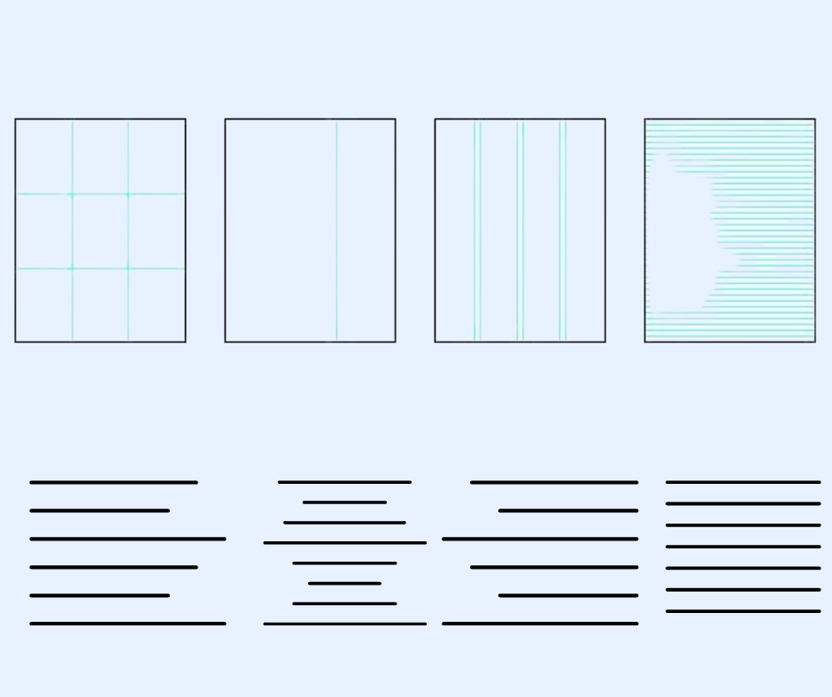
Grids and alignment provide structure and organization to a design, resulting in visual cohesion and a professional look. Here's why they are essential:
Consistency:
Grids help maintain consistency in spacing and alignment across different design elements.
Readability:
Proper alignment enhances readability and makes the content more accessible.
Balance:
Grids aid in achieving balance and harmony in a layout.
Practical Tip:
Utilize grid systems or guides to align and organize the various elements within your design.
Example:
The use of a grid system is evident in the layout of newspapers, where articles, headlines, and images align consistently, providing a clean and organized appearance.
Case Study: How Airbnb Utilized Graphic Design Principles
Let's take a look at how Airbnb effectively applied graphic design principles to their branding and user interface:
Simplified Logo:
Airbnb's logo uses simple lines and negative space, conveying openness and inclusivity.
Colour Palette:
They chose a vibrant colour palette that represents different cultures and destinations, evoking excitement and wanderlust.
Consistent Typography:
Airbnb uses the font Cereal throughout its branding, creating a consistent and recognizable visual identity.
Visual Hierarchy:
Their website guides users' attention through clear headings, prominent images, and well-organized listings.

Conclusion:
By understanding and applying these graphic design principles, you can create visually stunning designs that captivate your audience and effectively communicate your message. Whether you're a business owner or a design enthusiast, incorporating balance, colour theory, typography, visual hierarchy, white space, consistency, and alignment will elevate your designs to new heights. Remember, great design has the power to leave a lasting impression and establish a strong brand presence.

